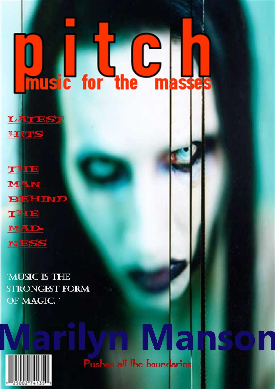
Wednesday, 30 December 2015

Publication plan

Publication plan
Front page

Title/Masthead- ALT
Frequency of publication- Every month
Price- £3.75
Who will distribute the magazine ?- Bauer because it is an established company that has lots of links within the industry. Also it mainly handles rock and pop which is a similar genre to my magazine.
What my magazine offers- My music magazine is an alternative-pop magazine that features famous and rising artists, artist interviews, events.
Target audience- The target audience is specifically female but also males with the age range of 16-19
Conventions- Masthead that stands out, image of main cover star, artists name, anchorage text, cover lines around the main image, barcode, date and price.

Contents Page

-What's featuring in the magazine
-Secondary image of cover artist
-Images of supporting artists
-page numbers
-other links i.e twitter and facebook handle

Double page spread

For the double page spread I plan to have an interview format and the text is integrated around the image of the artist.
Also the title of the article will be at the top of the page.

Monday, 28 December 2015

Reaserch into a potential target audience


I've been researching into a potential target audience for my music magazine so I decided to use social media as it is a great way to get information quickly from the public. Twitter has recently introduced polls so I thought I would take advantage of this and create a poll to find out what age range is most likely to listen to alternative-pop music the most, as this is genre the artists that feature in my music magazine. From the results above it is clear that 16-19 is the age the public thought would listen to this type of music and this is helpful for me as I too thought that 16-19 is the most suitable age range, however 22% thought 12-15 is the age range likely to listen to alternative-pop music which I do have to take into consideration as a younger audience may like my music magazine too. Doing this has helped with my target audience choice as knowing my demographic before hand will help me create a better magazine.

Sunday, 27 December 2015

Organisation

I have been thinking about what I should call my music magazine and after lots of research and consideration I have finally created a name for my music magazine.
So I have decided to call my music magazine 'ALT' because the word is an abbreviation of the word alternative and this links to the type of music the artists featuring in my magazine will be producing.
Also the word alternative means a lifestyle that is diverse in respect to mainstream ones, or generally perceived to be outside the cultural norm and this will appeal to my target audience as being different is seen as cool to them.

Wednesday, 23 December 2015

Organisation

I'm currently in the process of creating a name for my artist and there are a few names I have come up with.

- Indiana
- Saint
- Ava
- May/Mae

Indiana is an elaboration on the feminine name India. India comes from the name of the country and began as a name in the 70s when Indian culture became a real interest in British society. Also the film 'Indiana jones' the main character, who is a male has the same name and he is seen to be an adventurous/courageous person. This relates to my artist as she is adventurous with her music and a confident person.

Saint has religious origin and means holy person. The reason why I like this name for my artist is because its daring to use as it does have religious origin so it relates to my artist as her music will be 'breaking boundaries' and slightly edgy.

Ava has Latin origin and the meaning of birds. I liked this name because the meaning of it suggests a carefree tendency as birds are seen as this, and this relates to my artist as cool/calm vibe to her.

May/Mae has Hebrew origin and means star of the sea and also has links to the calendar month. I liked this name as my artist is a star so the meaning of it is very fitting and because its a bit girly which relates to the feminine side of my artist. However I have not decided upon which spelling of the name I like best so I will decided upon that when I have finalised my artists name.

Here are a few combinations I have came up with using the names from above.

Ava Saint May/Ava Saint Mae
Ava Mae/May
Indiana Saint
Indiana May/Mae

From looking at these my Favourite is.............Ava Saint May/Mae because I like how poetic it sounds, however this may change but for now it is a strong contender.

Monday, 21 December 2015

Drafting and planning

So for my draft version of my music magazine I have been looking into makeup and hair looks for my artist and I have decided upon a look I will want my artist to wear.


For the make up look I have decided that my artist will wear quite a heavy eye look but natural every where else as I don't want my artist to look like she has too much on and I want the main focus to be the eyes so it can help draw in the readers attention. So for the eye look I'll be using a dark brown/grey in the crease and a light silver on the lids. Also I'll be using black eyeliner as I want a very dramatic cat eye look and I want this because it very edge and cool which help to relate to my artist genre and ethos.


For hair I want my artist to have their hair curled with a bit of volume as this is very glamorous and my artist does have a girly side to her, but also it is very 'old Hollywood' which relates to the retro elements of the artist. Furthermore I'm wanting my artist to have shorter hair as this is very 'chic' and has been a current trend, making my artist look more relevant and up to date.

Saturday, 19 December 2015

Organisation

For my draft version of my music magazine I want my artist to wear carefully selected clothing that will help convey what kind of artist she is. After doing some research and some consideration I have decided what my artist will wear.

 I want my artist to wear an embellished playsuit as they are a very popular trend which will help my artist look current. I've chosen a black playsuit in particular as black is a 'grungy' colour meaning that my artist will look cool which is useful as it relates to the alternative side of my artists music genre. Also the reason why I have choose an embellished playsuit is because I want my artist to have a girly element to her and also a bit of glam as she is a famous star.

 
I am also wanting my artist to wear a flowery bomber jacket. The reason why I want her to wear a bomber jacket is because I want my artist to have 'cool/retro-ness' about her as this is the kind of music the she produces, so the jacket helps to show that. Also the bomber jacket helps to add abit more of a personality to my artist as its quite quirky and you would not normally pair it with a playsuit, so by my artist wearing this is shows her originality. furthermore as I've said in a previous post part of the photo shoot will take place outside so the jacket is a practical
way of keeping the artist warm.

I'm having my artist wear all white high top converse as they are very popular trendy shoes that young people wear meaning that they can relate to my artist wearing them. Also it add to the quirkiness and originality of my artist style as converse are quite casual but the play suit isn't.


As you can see I have carefully considered what is my artist wearing and why and by doing this helps me do my photo shoot quickly and effectively as I have already planned what my artist is wearing.

Thursday, 17 December 2015

Organisation

As I've said before I am current making a draft version of my music magazine and right now I'm in the planning stages of it. Today I've been thinking about the location of my photo shoot and here is what I have come up with.

 For my main images I want a background to them so that's why I'm planning to take them on a wall with a mural like this. I've decided on this because i think it looks cool which helps with my magazines ethos and its looks interesting to have as a background. Luckily for
me a friend of mine has one so I'll be using theirs at their house.


Part two of the photo shoot will take place out side and I'm looking for a garden that has quite a lot of trees and forestry as taking photos in this setting will give the images a more relaxed feel and my artist will look more a natural as its in a 'real life' place.


By using two different locations for my photo shoot it will give me more of a choice as to what photos to use in the magazine.

Wednesday, 16 December 2015

Organisation


 I have looked into different props I could use when I do my photoshoot of my artist for my music magazine, and here are three that I thought may be a good idea to use.


The first prop I though of was a guitar because it helps to represent the genre of my magazine (which is alternative-pop) and because I am going to have a female artist a guitar will help them look abit less 'girly' and more cool, which will help a wider variety of people to like my artist.


The next prop that i thought would be appropriate to use is the CD the artist has created. The reasoning to this is because most music artists that feature in a music magazine are there to promote their new songs, so by my artist having their album as a prop will help my magazine look more realistic.


The final prop that may be effective to use is a microphone. I think this because as my artist is a singer it will help the audience see what they do by simply glancing at the magazine cover. Also I could get my artist to actually sing while I'm taking photos which will help them look like a proper singer and the shots of them will look naturalistic.


Using props can help my photos of my artist look effective however i don't want them to be the main focus as the most important thing is my cover artist. when I go to do my photoshoot of my artist I will try and bring a verity of props with me to the set as I want to have choice and I want to see if it works or not.

Tuesday, 15 December 2015

Organisation


 Photography effects play a big part in the ethos of a magazine because it can help convey a message. For example using a black and white effect can give a timeless look to a magazine suggesting that the genre is older music and also it has connotations of style and sophistication. The use of a lenses focus will need to be considered as if you are taking a photo of a single artist the face should be in focus as it needs to draw the reader in. When I start to take photos for my music magazine I will play around with different effects and the amount of focus used, so I can get some successful shots. Also I will look into editing the photos as many effects can be added on to the photo.

Thursday, 10 December 2015

Drafting and Planning

I have used a visual thesaurus to provide me with synonyms of words that are related to 'cool'. The reason I have chosen the word 'cool' is because I think this will be my main premise of my music magazine. As I've said in my previous post about wanting my artist to be within the Alternative-pop genre, this is another reason why I have chosen 'cool' to be the bases of my magazine because artists in that genre are. From creating this visual thesaurus, one word I liked from it is "Poise' because the meaning of this word it 'graceful and elegant bearing in a "person' .. The word I think could also make a suitable masthead as I want my magazine too look elegant so by having it as my music magazine name it will help tie my magazine together. The word would make a short and simple magazine name like for example 'vibe' or 'Mojo' because it catches the audiences attention due to its lengths making it easily memorable. After using a visual thesaurus I have found this a useful tool with helping find a magazine name and even though I like the word 'Poise' I will continue with my research to help me develop my ideas to create a masthead that successfully captures my magazines ethos and genre.

Tuesday, 8 December 2015

Organisation


I have looked into the style of artist I want to create for my music magazine. I have decided that I want to have a female artist for my magazine because the style of music I majority listen to are female artists. The three photos above are of well known Alternative/pop artists which I would like my artist to be like. As you can see that these artist have a very 'cool' element to them as in the photo they have a quite blank expression. So when I come to create my artist I will use these three artist to influence the style of my artists and I will be referring to them closely to create a realistic artist that people can like.

Sunday, 6 December 2015

Research and planning

Today I have looked into the typical stories found in music magazines. From reading a few different issues from music magazines, mostly the article consists of an interview with the artist. For example from the first magazine on the right featuring the interviewer asks "what defines a rock star" and this is important because It helps the artist to talk about a specific thing that the interviewer wants and that's related to the magazine, as this magazines genre is rock so the question will relate to rock fans which will make them interested and want to read on. In the second magazine featuring Nicki Minaj the article relates to the theme of the issue "Gospel according to Nicki Minaj". This is shown in the headings of each sections of interview because they are in the style of biblical commandments, for example "Thou shall walk tall" this is effective because it keeps a consistent theme running through the magazine which is professional. From looking at these articles I know now that to create a successful magazine article I need to make sure that the questions asked to the artist are relevant to the magazines genre and theme. So when I come to create my music magazines article I will need to carefully consider my questions in order to convey specific information about the artist.

Thursday, 3 December 2015

Research into similar products

This here is the vibe magazines contents page and I have looked at this today because this may be the potential layout I go for when I create my own contents page for my music magazine.

The layout for this contents page is very simplistic however it gives of a stylish look which is professional and the use of only having one column under the artists arm makes it easer for the reader to read as there is a lot of focus on it.

Also by only having one image of the cover artist on the contents page clearly shows that this issue is about him which I find in my opinion very effective as it suggests to the audience that the main article, the double page spread will also be about him.

From looking at this contents page from the vibe magazine it has given me a better idea as to what I want to do for mine and I will take the successful elements of this contents page and input it into my own.

Wednesday, 2 December 2015

Remake and remodel task peer assessment

.After creating my remodelled version of the NME magazine (http://benitaasmedia.blogspot.co.uk/2015/12/remake-and-remodel-task.html) I showed one of my peers my finished product to receive some feedback from it.

I was told that the colour scheme of red, white and black was effective because these are the colours NME usually uses for its magazine and those colours are known to be associated with the NME magazine, so that fact that I used it helps the audience to easily identify the magazine.

Another thing I was told that my photography of the main cover star was effective as it was in a similar style to an NME main cover image and this helped to truly reflect the magazines ethos as the artist had a blank/mysterious facial expression and automatically shows what genre it is.

An improvement I was told was that I could have included a secondary image with the cover lines to help show what artists are included in the issue and also this is normally what professional magazines do.
From receiving this peer assessment I agree with my peer's comments because for example I do think the colours I used for my remade version of the NME magazine helped to show that it was an NME magazine that I'm recreating. So when I come to create my own music magazine front cover I can come back to this post to see all the successful things I have done and also the things I need to improve upon.

Tuesday, 1 December 2015

Remake and remodel task

I was set the task of remaking and remodelling a well known music magazine so I decided to do the NME magazine.
From my previous blog posts you can see the I have thoroughly researched the key codes and conventions the NME magazine uses to make their very successful magazine, which was very useful tome as it helped me to create this front cover.
Doing this task was very beneficial as creating this magazine front cover I now know what specific features NME uses to successfully create its magazine. So when I come to create my own music magazine I can look back on this task to help me create an effective music magazine front cover.


Thursday, 26 November 2015

Drafting & Planning

As I have said before, I am re creating a music magazine and the magazine in particular I have chosen to do is NME so I have taken some photos to use for the front cover.

From researching the NME magazine I know that the image of the main cover artist on the front cover consists of a white back ground and a male cover artist. So I have taken some photos in that style.

Also from researching the magazine I have noticed that the main cover artist usually wears dark clothing hence why my cover artist Is wearing dark clothing and furthermore the main cover artists on the NME magazine normally has a blank facial expression because NME's music genre is alternative/rock which is stereotypically associated with being 'cool'.

I will use these photos that I have taken to recreate a music magazine in the style of NME.

Wednesday, 25 November 2015

Research into similar products

 
As I said in my previous post for a task I am recreating the NME magazine. I have been researching into the magazine so I can successful recreate it and from looking at the magazine I have noticed that most of the main cover artists that are featured on this magazine are men. The main reason of this is because NME's magazines genre is alternative/rock and most artists in this category are men, also the magazines target audience is aimed at guys so the use of male cover artists is appropriate. By me now knowing this, when I come to create my remodelled version of an NME magazine I will use a male for my main cover artist to truly show that I've made a magazine in the style of an NME magazine front cover.

Tuesday, 24 November 2015

Research into similar products


I am planning to create a front cover in the style of the famous music magazine 'NME' and I have chosen to do this magazine in particular because of its very distinct stylisation.

From researching into this magazine I can see that the colour scheme which is red, white and black is very constant as these are used on nearly all issues of this magazine. Also the magazines ethos is consistent too because the use of 'cool/alternative' artists on the front cover and this is effective because the magazines target audience are fans of this sort of music.

when I come to recreate this magazine I will try to incorporate most of the magazines key elements to help successfully convey that its an NME.

Wednesday, 18 November 2015

Research into similar products


Adele is a Grammy Award-winning artist whose soulful sound has made her an international success with hits like "Rolling in the Deep" and "Someone Like You." From North London, England the singer has sold millions of albums worldwide and winning multiple Grammys. She also received a songwriting Oscar for the James Bond track "Skyfall."
Adele is an iconic figure is the music world hence why she is hugely successful and know to many people.

Due to her popularity from her songs Adele is easily recognisable which explains why on most music magazines she features on the front cover is very minimal and simplistic. This is the same for the 'Rolling stones' magazine featuring her because as you can see it that the front cover only includes a masthead, main cover image, main cover line and a small bit of anchorage text. This magazine cover featuring Adele used simplicity very well and even the cover artist has a minimal use of gimmicks as you can see that she has a small amount of makeup on and a dressing gown.

From looking at this I now know that the cover artists popularity is a key factor when creating magazine front cover as when I come to create my music magazine I will probably have to include more things like cover lines because of the fact that my artist I create won't be as famous so more will need to be revealed about them in order for the reader to actually want to buy my music magazine.

Tuesday, 17 November 2015

Research into similar products


Here are two music magazines that use two different shot types for its main cover image. The first magazine which is the "Billboard" magazine featuring Adele uses a medium close up shot and this helps draw the reader to her face, making them instantly realise who it is and what is the magazine issue about. Also because Adele is a solo artist it is appropriate to use a medium close up as the enphasis of the magazine should solely be on her.
The second magazine is the "Rolling stones" magazine featuring The strokes uses a full length shot. The use of this shot in particular is effective for the magazines cover artist because of the fact that they are a band so for the reader to easily see and identify who it is a full length shot is used. Also by using a full length shot to see all of the cover artist helps to show that everyone in the band plays an equal part.
From looking at these two magazines I know that the type of shot used for the main cover artists image is important and when I come to create my own music magazine I will have to think about this when I decide who my artist is.

Monday, 16 November 2015

Research into similar products

This is the NME magazine featuring Rihanna and i have chosen to look at this magazine in particular because of the effective use of its colour scheme.

There is a minimal amount of colours used on this front page which is effective because it helps to draw attention to the things in pink i.e the masthead. The fact that they are in a different colour helps to highlight the key points of the magazine and and the use of pink shows Rihanna's femininity.

From looking at this i now know that the use of colour plays a big factor in what message you are trying to convey to the reader. So when i come to create my music magazine i will think carefully about what colour i'll use to help highlight specific things.

Thursday, 12 November 2015

Research into similar products

Here is the NME magazine featuring Ian Curtis from the band Joy Division and I have chosen to look at this magazine because the house style, text and colour helps to covey that this issue in particular is a special. Ian Kevin Curtis was an English musician and singer-songwriter. He is best known as the lead singer and lyricist of the post-punk band Joy Division and he died 18 May 1980 and this is significant because in this issue they are celebrating 30 years of joy division. The use of the black and white colour scheme is effective because it gives a sense of timelessness, as if the artists relevance and memory of them will live on and it also takes away the distraction of colour which causes the reader to focus on the main image of the cover artist. The fact that all the relevant information about the band is in bold black text highlights the emphasis on the message of this issue which is the artist. Furthermore even though this issue is a special addition the house style of the magazine is still similar, like the masthead is the same and in the same position. However this still fits the theme of this issue and helps to tell the reader that they are looking at an NME magazine due to the masthead being red and standing out. From analysing this magazine front cover I now know the importance of the use of house style, text and colour as these can make a big impact on the magazines message. So when I come to create my own music magazine I will think about what in particular I want to tell the reader in my issue.

Wednesday, 11 November 2015

Research into similar products


 Here are three different issues from vibe magazine and I have selected to look at vibe's magazine front cover today because it is a clear example of how a magazine sticks to its chosen music genre. As you can see these three magazine front covers have a very similar format to it, which is main cover artist in the middle, masthead on the top of the page and the cover lines around the artists. I think this is effective because by sticking to a similar format it allows the reader to be familiar to the magazine also it makes the magazine identifiable as audiences will know without even looking at the masthead that it is a vibe magazine. Also the fact that the magazine solely features 'hip-hop' artists makes this magazine stand out to a particular audience. By having artists from the same music genre explains why the magazine uses the same format as they know that it helps to convey their specific music genre meaning that it appeals to the audience. From doing this research I now know that to create a successful music magazine I must have my chosen music genre already planned because it will help me easily put together the magazine as I will have an idea of what I want to include on it in mind.

Tuesday, 10 November 2015

Layout and conventions feedback

I have been peer-assessed on the positives and negatives of my layout and conventions task that I have completed below  ( http://benitaasmedia.blogspot.co.uk/2015/11/layout-exercise.html )

For the 'M' magazine featuring drake my peer said that the text used on the cover was very good as the font was appropriate to the magazines genre and that the colours I used were very effective because it matched what the cover artist's clothing which helped relate the magazine back to him. I was told to that I should make the cover line text larger as it may cause difficulty reading, also where it says "more artists inside !" I should include which artists are so then the reader may see an artist that they like.

The positives for the other 'M' magazine featuring a unknown band that I had to create an identity for was that I successfully created a name for the band which was "Poised Resonance" and this was used for the main cover line. I used colours effectively as I kept it simple, by only using black which helped make the magazine look professional. Also I was told that the use of different size text for the cover lines helped make specific parts of It stand out. The negatives I was told that I only used the top right half of the magazine, so I should maybe add some smaller images and more text to the front cover.

For the "Music_X" magazine featuring bijork I was told that my cover lines was effective because I gave an insight as to what the interview with bijork is about and the anchorage text used fitted perfectly with the magazines theme. I was also told that the layout was successful as I put everything around the main cover image of bijork which helped to show the reader that the main focus of the magazine is about her. However the negatives I was told from this magazine is that I should maybe use a fewer style of fonts as this can look unprofessional.

The positive feedback I was given for the "Pitch" magazine featuring Marilyn Manson was that the main cover line is effective as it clearly states what this magazine is about and also the colour used for it fitted in with the colour scheme. Also the use of the colour red for the cover line are effective as it goes well with the masthead as contrasts with the photo of Marilyn Manson's face. An improvement I was given was that add text to both sides of the cover as it looks a bit empty.

The final magazine I was given feedback for was the 'Sound' magazine featuring the kings of Leon. I was told the cover line was effective because it tells the audience why the are back in the spotlight and also the anchorage text is effective because it relates to the main cover line and it gives an insight as to what will be in the article about them. Furthermore I was told that the use of puff was really good as this is what you would normally see on magazines, making mine look more realistic. A negative I was told that I haven't included many cover lines to do with the band, and also the placement of some of the cover lines means that its not easily read.

From receiving this peer assessment I agree with most of my peer assessors comments, for example the one from the Marilyn Manson magazine because now reflecting on it I understand that it does need more things included on it. I plan to use this feedback from my task to help me create a successful music magazine as now I can look back and see where I struggled most with and improve upon it when I come to create the real thing.

Friday, 6 November 2015

Layout exercise


 Here i have experimented with different layouts, cover lines and fonts on theses magazines. The first the magazine cover i did was the 'pitch' magazine featuring Marilyn Manson and i chose to use red and blue for the text because i thought i fitted in well with the magazine. Another one i did was the 'music x' featuring the artist Bjork. I used simple colours because the photo of her is quite minimalistic also i used a well known quote that she says to help the magazine relate back to her. For the 'M' magazine i had to create an identity for the band so i decided to call them 'Poised resonance' because i thought it suited them and their look. From doing this task it has shown me that the use of colour, typography and cover lines are important to make a magazine look effective and to help show the genre. Furthermore it has made me take layout into serious consideration as it is a very important aspect into making the magazine look good and believable. When i come to create my magazine i will refer back to this task to remind me how the layout can have an impact on a magazines genre and ethos.


Thursday, 5 November 2015

Research into similar products

A music genre I have research into is Rock Music.
Rock music is a popular genre of music that has originated from "rock and roll" in the United States in the 1950s, and has developed into a range of different styles.

Famous old rock artists include bands like The Beatles, Pink Floyd and Led Zeppelin were very popular in their time due to the fact their high produced quality of rock music that their fans loved. However in todays society rock music has evolved massively due to mainly influences like the media.

Rock music is now highly regarded as 'cool' with many people including young adults so now new 'Rock' bands try to cater for them by adding other influences to their genre. For example
pop-rock, alternative-rock and indie-rock.
This is very beneficial for bands to gain more of a fan base however when publicing for them- like a magazine cover- there style is needed to be taken into consideration very carefully to create a successful cover and to convey clearly the magazines and the bands ethos.

When I come to create a cover artist for my music magazine I will have to carefully decide on things like hair, make up and costume if my artists music style is a genre cross over so that I can make sure it appeals to the right target audience.

Tuesday, 3 November 2015

Research into similar products

Here are two very contrasting music magazine front covers and I am analysis the effectiveness of the main cover image.

The first magazine is a Rock music magazine tailored to classic rock fans and as you can see it has a photo of a rock artist for its main image. This image is effective because the artist is wearing 'cool' 'edgy' clothing that tells the audience what kind of artist he is and also the fact that he has a bland facial expression gives off this 'not caring' vibe which stereotypically teenagers who are a fan of this music genre are. Furthermore the low key lighting used for the main image is effective because it gives off a dark aura which normally rock music is linked to therefore appealing to it target audience.

The second music magazine is a pop magazine targeted at young teenage girls. The main cover image is a photo of the famous British pop band One direction which automatically appeals to its target audience as they a very popular with teenage girls and also the fact that they are all happy and smiling in the photo of  them instantly gives off a positive vibe which the magazine is aiming for. Also high key lighting is used relates to the magazines ethos of it being bright and fun.

From looking at these two magazines you can see there is a distinct difference in main cover image styles and now when I come to create my own music magazine I can see that the main cover image makes a really big impact on the genre you are trying to covey.

Sunday, 1 November 2015

Reaserch into similar products

Here I have looked into an artist that is similar to the artist I want to create for my music magazine. The artist I have looked at today is "Marian Hill"

Marian Hill is an American song writing artist from Philadelphia.
Her first album that was released early this year incorporates indie pop and jazz influences which has shown to be a success due to the popularity of the album.

Marian Hill is known for her delicate voice and meaningful lyrics which is reflected through her songs. Also the fact that she has many musical influences, such as blues and electro-pop makes her songs popular as in todays top charts as there isn't many other artists with similar influences furthermore there's a variety of types of influences which will appeal to a larger audience.

I personally like Marian's originality in her music style because she has taken many different musical influences to create her songs. Also her album cover helps to reflect her singing style as she has a delicate yet different voice which is like the album cover which is simplistic but quite abstract.


Saturday, 31 October 2015

Reasearch into similar products

Here I have analysed this double page spread of Lana Del Rey for its codes and conventions. I have chosen to analyse this double page spread in particular because the artist used in this spread is the same genre of music I like and want to do for my music magazine. so when I come to create my music magazine I know now what thing to include to make it effective and how it can relate to the music genre.