I have been peer-assessed on the positives and negatives of my layout and conventions task that I have completed below (
http://benitaasmedia.blogspot.co.uk/2015/11/layout-exercise.html )
For the 'M' magazine featuring drake my peer said that the text used on the cover was very good as the font was appropriate to the magazines genre and that the colours I used were very effective because it matched what the cover artist's clothing which helped relate the magazine back to him. I was told to that I should make the cover line text larger as it may cause difficulty reading, also where it says "more artists inside !" I should include which artists are so then the reader may see an artist that they like.
The positives for the other 'M' magazine featuring a unknown band that I had to create an identity for was that I successfully created a name for the band which was "Poised Resonance" and this was used for the main cover line. I used colours effectively as I kept it simple, by only using black which helped make the magazine look professional. Also I was told that the use of different size text for the cover lines helped make specific parts of It stand out. The negatives I was told that I only used the top right half of the magazine, so I should maybe add some smaller images and more text to the front cover.
For the "Music_X" magazine featuring bijork I was told that my cover lines was effective because I gave an insight as to what the interview with bijork is about and the anchorage text used fitted perfectly with the magazines theme. I was also told that the layout was successful as I put everything around the main cover image of bijork which helped to show the reader that the main focus of the magazine is about her. However the negatives I was told from this magazine is that I should maybe use a fewer style of fonts as this can look unprofessional.
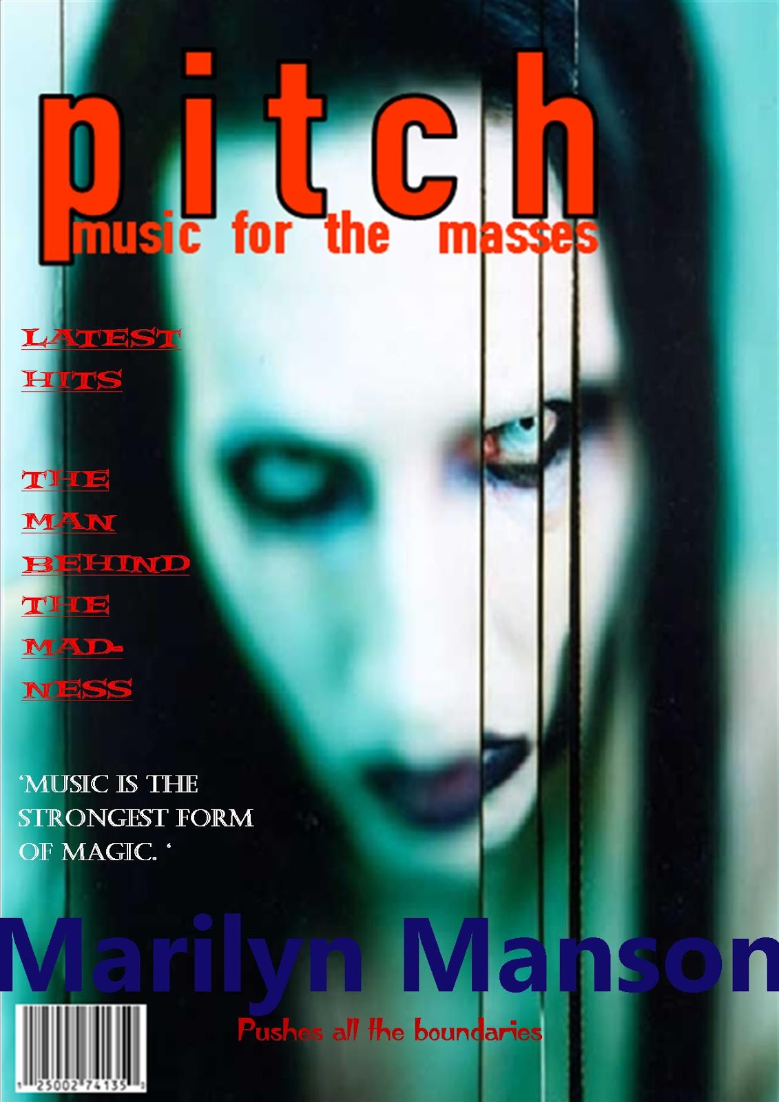
The positive feedback I was given for the "Pitch" magazine featuring Marilyn Manson was that the main cover line is effective as it clearly states what this magazine is about and also the colour used for it fitted in with the colour scheme. Also the use of the colour red for the cover line are effective as it goes well with the masthead as contrasts with the photo of Marilyn Manson's face. An improvement I was given was that add text to both sides of the cover as it looks a bit empty.
The final magazine I was given feedback for was the 'Sound' magazine featuring the kings of Leon. I was told the cover line was effective because it tells the audience why the are back in the spotlight and also the anchorage text is effective because it relates to the main cover line and it gives an insight as to what will be in the article about them. Furthermore I was told that the use of puff was really good as this is what you would normally see on magazines, making mine look more realistic. A negative I was told that I haven't included many cover lines to do with the band, and also the placement of some of the cover lines means that its not easily read.
From receiving this peer assessment I agree with most of my peer assessors comments, for example the one from the Marilyn Manson magazine because now reflecting on it I understand that it does need more things included on it. I plan to use this feedback from my task to help me create a successful music magazine as now I can look back and see where I struggled most with and improve upon it when I come to create the real thing.
 As I have said before, I am re creating a music magazine and the magazine in particular I have chosen to do is NME so I have taken some photos to use for the front cover.