
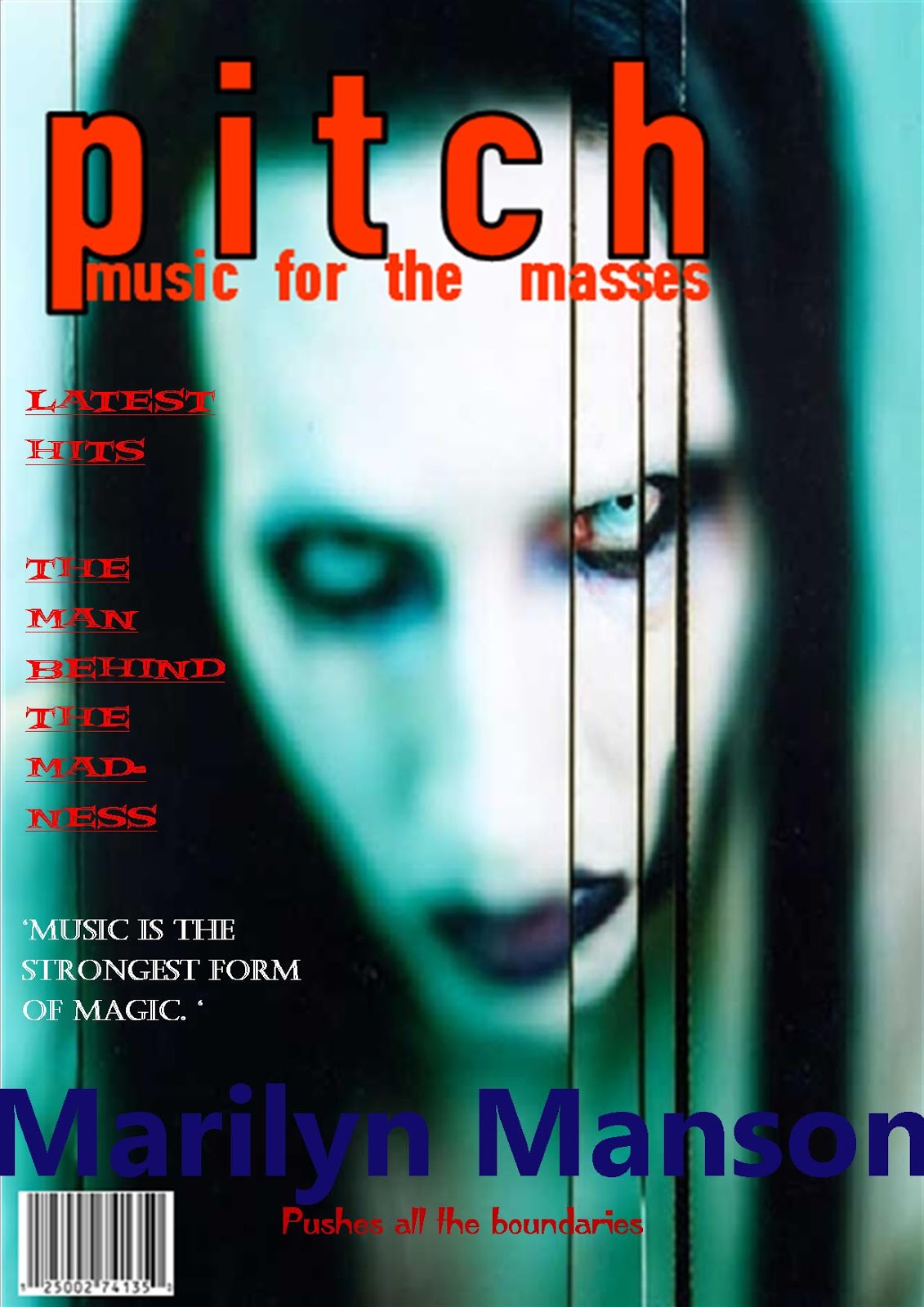

 Here i have experimented with different layouts, cover lines and fonts on theses magazines. The first the magazine cover i did was the 'pitch' magazine featuring Marilyn Manson and i chose to use red and blue for the text because i thought i fitted in well with the magazine. Another one i did was the 'music x' featuring the artist Bjork. I used simple colours because the photo of her is quite minimalistic also i used a well known quote that she says to help the magazine relate back to her. For the 'M' magazine i had to create an identity for the band so i decided to call them 'Poised resonance' because i thought it suited them and their look. From doing this task it has shown me that the use of colour, typography and cover lines are important to make a magazine look effective and to help show the genre. Furthermore it has made me take layout into serious consideration as it is a very important aspect into making the magazine look good and believable. When i come to create my magazine i will refer back to this task to remind me how the layout can have an impact on a magazines genre and ethos.
No comments:
Post a Comment